
Sartorius AG · 2024-2026
Document Hub search & navigation redesign
When a third of users gave up before finding the right document.

01
The Challenge
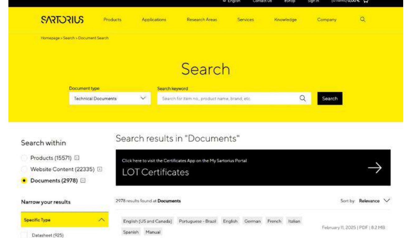
The Sartorius Document Hub is where lab scientists, quality teams, and biotech engineers go to find product documentation: certificates, manuals, safety data sheets, technical files. In a regulated industry this is not filler content. It backs compliance, procurement, validation, and everyday lab work, so getting to the right file quickly is real operational value. When discovery is slow, people retry, abandon the hub, or raise a support ticket for a document that was there all along. The platform’s own analytics put a number on that cost: in the search-journey funnel, roughly a third of users, about 35%, dropped out before they reached a document.
I led a UX research engagement for the Digital Customer Experience team to answer a deceptively simple question with rigor, not opinion.
Where does document discovery actually break down, and which evaluation method best surfaces those problems so we can fix the right things first?
02
The Research Approach
Any single method has a blind spot. Experts catch structural flaws but assume how people behave. Users reveal intent but cannot see the whole system. Analytics show what happened but not why. So I deliberately ran three complementary methods against the same task, the same screens, and the same scenario, then triangulated them. Where independent methods agreed, I had high-confidence evidence; where they diverged, I learned something new.
Heuristic evaluation
An expert review of every key page against Nielsen’s 10 usability heuristics, to surface structural issues in navigation, hierarchy, and filtering logic.
Moderated usability testing
Think-aloud sessions with professionals who work with technical documentation daily, performing a real retrieval task, to capture how they interpret and decide.
Behavioral interaction data
Hotjar click, scroll, and cursor heatmaps of the live results page, to see where attention actually goes under natural use.
I worked page by page across seven core surfaces, the landing page, technical documents, ISO and instrument certificates, search results, the no-results state, and the related products pop-up, and scored every issue on a P0 to P3 severity scale so blockers never got lost next to cosmetic nits.
P0 - Critical
Blocks the task. Must be fixed first.
P1 - High
Major effort or confusion on the way.
P2 - Medium
Noticeable friction, task still possible.
P3 - Low
Minor clarity issue, low risk.
03
Who I Designed For
Two user types anchored the research, and they pull in different directions, which kept the trade-offs honest. One lives in the hub and knows the terminology; the other drops in occasionally and does not. A good design has to serve both.

Anna
QA & Regulatory specialist
Lives in the hub, knows the terminology
Anna pulls certificates and safety data sheets every day to keep audits and batch releases moving. She knows the product numbers and document types by heart, so she expects to get in, grab the exact file, and get out. Friction for her is measured in seconds and repeated searches.
Goals
- Retrieve the exact certificate or SDS in seconds
- Trust that she has the current, correct version
- Move through high-volume document pulls without slowing down
Frustrations
- Long, dense filter lists slow down a task she does constantly
- Selected filters are easy to lose track of when scrolling
- A failed search means starting over with no guidance
04
Expert Review (Heuristic Evaluation)
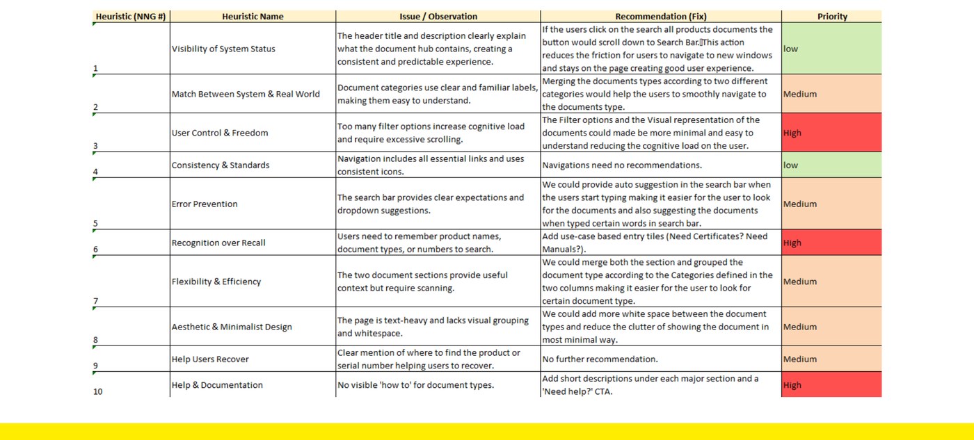
I started with the expert lens, walking each page against all ten heuristics and turning every observation into a concrete, prioritized fix. This matrix became the backbone of the study, evidence on the left, a recommendation and a severity on the right. It flagged the most structural risks: dense filtering, weak visual hierarchy, and a reliance on recall over recognition.
05
Usability Testing (Think-Aloud)
The expert review tells you what might be wrong. To learn how it actually feels, I ran moderated think-aloud sessions with professionals who use technical documentation platforms in their daily work. Each was given the same realistic task, find a specific ISO 9001 certificate, and asked to narrate their thinking while I observed navigation, hesitation, and filter choices, followed by reflective questions on clarity and confidence.
Searching is just the first thing I do. The menus have too many options to bother going through.
I wasn’t sure if the language filter meant the document’s language or my region.
I’d rather narrow it down with filters than read through a long list of results.
Everyone completed the task, so the core retrieval works, but the path was uneven. One participant finished in about a minute and felt confident; another took roughly three and explored several filter options before committing, which told me familiarity with the terminology, not the task itself, was driving the effort. Three patterns came through clearly.
Search is the first move
People went straight to search and barely explored the navigation, treating it as the fastest, safest way in.
Filters need interpretation
Both paused to decode filter labels and categories, spending real cognitive effort before selecting.
People minimize scanning
They filtered early and scanned titles and metadata rather than read long result lists end to end.
06
Behavioral Signals (Heatmaps)
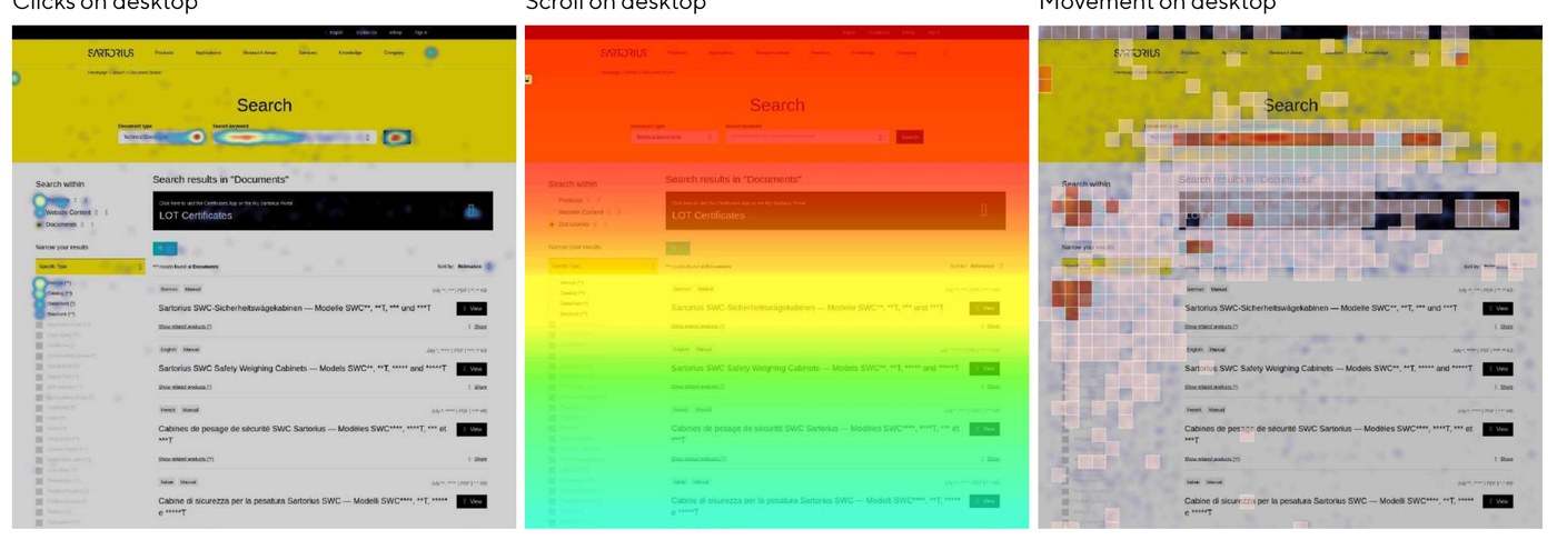
Finally, the behavioral lens. Hotjar click, scroll, and cursor heatmaps of the live results page showed where attention really lands, independent of what anyone said. They confirmed the picture: search is the front door, and engagement falls off a cliff below the fold, so useful filters and content placed lower were quietly being missed.
Attention crowds the search bar
Clicks and cursor movement concentrated around search and the first results, confirming it as the primary strategy.
Only the top filters get used
Interaction clustered on the first few filter options, so extended lists were rarely fully explored.
Scroll depth collapses
Activity dropped sharply down the page, so anything below the initial viewport risked going unseen.
The heatmaps themselves are qualitative, so I read them as directional. But they line up exactly with the hard number from the search funnel: that steep below-the-fold collapse is the behavioral signature of the roughly 35% of users who drop out before reaching a document. When the right result is not immediately visible, people give up rather than dig. The expert review and the interviews pointed to the same place, which is what gave me confidence in where to focus.
07
Benchmarking the Field
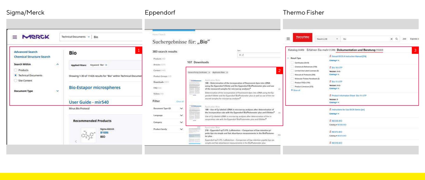
To ground the recommendations in proven patterns, I benchmarked the hub against three mature documentation experiences. Sigma/Merck leans on strong faceted filtering, Eppendorf uses clean card-based category grouping, and Thermo Fisher segments by document type early. Mapping the hub against them made the gaps concrete.
| Approach | Faceted filters | Doc-type grouping | Rich result metadata | No-results recovery |
|---|---|---|---|---|
| Sigma / Merck | ||||
| Thermo Fisher | ||||
| Eppendorf | ||||
| Sartorius (current) |
08
Where the Evidence Converged
With three independent views in hand, I mapped every issue into a triangulation matrix and sorted findings by how the methods related to each other. That structure is what turns a pile of observations into a confident, defensible set of priorities.
Convergent
Issues all three methods flagged. The strongest evidence, and where I focused the redesign first.
Complementary
Issues each method explained from a different angle, deepening the why behind a single problem.
Unique
Issues only one method could see, a reminder that no single method is enough on its own.
Filter complexity was the clearest convergence: the expert review flagged the density, users hesitated over the labels, and the heatmaps showed people only touching the top few options. Search-reliance and recognition-over-recall converged too. Those agreements became the prioritized findings.
Filters are dense and hard to scan
Flagged by all three methods. Long, uniform filter lists force people to process many options at once; users paused to interpret labels, and heatmaps showed engagement only with the top few before relevant filters effectively disappeared.
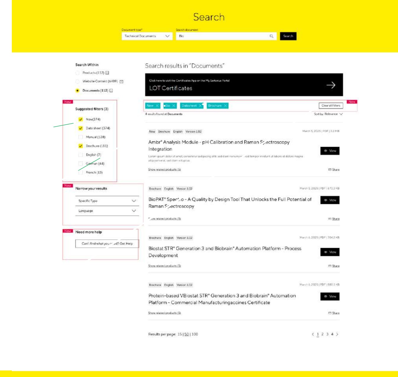
Fix: Move high-utility filters like Document Type and Language to the top, collapse secondary ones by default, surface suggested filters per query, show selected filters as removable chips, and add a clear Clear all action.
Search is central, but not forgiving
Search drew the most attention across every method, yet it offers no autocomplete, no typo tolerance, and few examples of what to type. In a hub where people rarely know the exact product number, small mistakes turn into failed searches.
Fix: Add product and document-type autocomplete, did-you-mean typo tolerance, clarifying placeholder examples, and quick chips for common document types.
No-results is a dead end
A failed search offers little beyond asking the user to try again. There is no path forward, which is exactly where less-fluent users like Markus drop off.
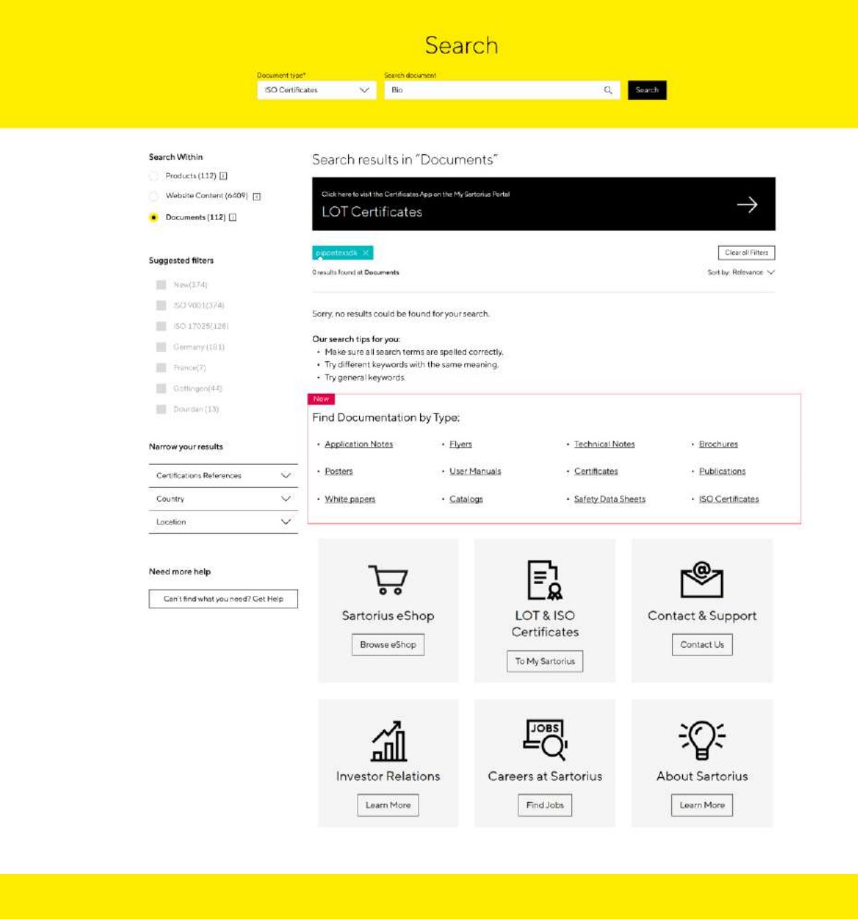
Fix: Turn the empty state into a recovery hub: search tips, alternate keywords, shortcuts to common document types, and a clear way to request a missing document.
Labels assume domain knowledge
Document categories and filter labels lean on internal terminology, so recognition turns into recall. Participants were unsure how to distinguish certificates, manuals, and technical files, or what a label like Language actually scoped.
Fix: Group by what people look for, clarify ambiguous labels, and add light contextual guidance so the interface supports recognition over recall.
09
The Recommendations
I translated the converged findings into a focused set of design moves, each aimed at one thing: helping people form a better query, narrow results with confidence, and recover when a search fails.
Forgiving search
Autocomplete, did-you-mean, example placeholders, and quick document-type chips.
Filters that guide
Reordered groups, collapsed secondaries, suggested filters, chips, and Clear all.
Recovery-first empty state
Tips, alternate keywords, document shortcuts, and a request-a-document path.
Controllable related products
Search, sort, and filter inside the modal for long lists.
Clearer certificate flows
Mark Product and Serial Number as required, with guidance on where to find them.
User-centered structure
Group by what people look for, not by internal taxonomy.
To make the direction tangible, I mocked up the two highest-impact screens. On the results page, suggested filters move to the top, secondary ones collapse, selected filters become removable chips, and a clear Clear all action appears, so narrowing down stops being guesswork.
And the dead end becomes a way forward. The no-results page keeps the search tips but adds a Find Documentation by Type section and quick links, turning a failure into a recovery path.
10
Prioritized Roadmap
Not everything is equally easy, so I sequenced the work by impact against effort, quick wins first, deeper platform changes second.
Short term
- Did-you-mean logic and common search chips.
- Reordered, collapsible filters with selected-filter chips.
- A recovery-focused no-results page.
- Contextual help and clearer, less ambiguous labels.
Longer term
- Product-aware autocomplete for SKUs and serial numbers.
- Contextual filters that adapt to the document type.
- Richer result metadata and a card or tile-based layout.
- Task-based testing to validate the redesigned flows at scale.
11
Reflection
The headline answer to the research question: no single method tells the whole story. Heuristic evaluation surfaced the most structural risk, usability testing explained how users actually reason through the interface, and behavioral data confirmed where their attention really went. Treated as complementary rather than competing, they produced priorities I could defend, and a redesign that targets the few moments that decide whether someone finds their document.
UX quality in a documentation platform depends on recovery and recognition, not just the ideal path.
People arrive with partial information, a half-remembered product name, a serial number they cannot find, a guess. A strong experience helps them form a better query, narrow with confidence, and find a way forward when a search fails. When the prioritized changes were applied, the search-journey funnel bore this out: task completion rose by about 15% and fewer users dropped out before reaching a document. The next step is to keep instrumenting the redesigned flows to see how far those gains extend.
Want the full story behind this work?
Let's Chat