
M.Sc. Research · 2024-2026
Hogrefe Quick Scoring Service
A usability research study on a digital quick-scoring service.
Rights remain with Hogrefe
01
The Challenge
Hogrefe’s Smart Scoring Service is a web app that lets psychology professionals score clinical questionnaires on screen instead of by hand. Scoring assessments on paper is slow and error-prone, so the promise is real: enter the responses, let the tool do the math, get a report. The question was whether the tool actually delivers on that promise, or quietly gets in the user’s way.
Which layout gives professionals the most usable, satisfying way to score a questionnaire, and which elements can be optimised to make it faster and clearer?
I led the research side of a mixed-method usability study: planning and moderating the sessions, then synthesising what we saw into a prioritised set of design recommendations.
02
The Research Approach
A small sample only produces reliable signal if you look at it from several angles, so I stacked five methods around the same scoring tasks. What people said, what they did, and where they actually looked, captured together, let me triangulate friction instead of guessing at it.
Structured interviews
Warm-up questions, task-based use cases, and reflective post-interview questions to frame each session.
Tobii eye-tracking
A screen-based eye-tracker recording exactly where attention went during the scoring tasks.
Web-cam capture
Verbal and behavioral cues recorded for closer analysis after the sessions.
Screen recording
The actual interaction behavior, step by step, for reviewing the exact path users took.
Participant observation
Live notes on verbal and non-verbal reactions in the moment.
Four psychology students from PFH University took part, close to the real user: familiar with questionnaires and scoring, but not with this particular tool.
03
Who Uses It
Two user types framed the study, and they need different things from the same screens. One scores assessments constantly and wants speed; the other is still learning and needs the interface to teach as it goes.

Lena
Clinical psychologist
Scores assessments every week
Lena runs psychological assessments and scores questionnaires constantly. Hand-scoring is slow and easy to get wrong, so a digital tool is genuinely welcome, but only if it is faster than paper and does not ask her for things she should not have to share.
Goals
- Score a completed questionnaire quickly and correctly
- Trust the result without double-checking against a legend
- Get in and out without unnecessary data-entry steps
Frustrations
- Transcribing dozens of digits by hand from a paper sheet
- Being asked for personal details that feel unnecessary
- Hunting for the scoring legend while entering values
04
The Tasks
Rather than ask for opinions, I put the tool to work with two realistic use cases drawn from how professionals actually score assessments.
Use case 1: first-time evaluation
You are evaluating a completed questionnaire, a colleague mentioned the Smart Scoring app, and you want to try it for the first time. Show me how you would use it.
Use case 2: digitising responses
You have a subject’s responses on paper and need them saved digitally in the app. Show me how you would enter them.
That second task, transferring responses from the paper sheet into the app, is where most of the friction surfaced.
05
The Scoring Flow
Before reading the findings, it helps to see the path. The tool walks the user from an access code through basic data and raw-score entry to a final report. Two steps quietly carry most of the risk: who the basic data belongs to, and the long stretch of transcribing scores.
Enter the access code
The Auswertecode for the test
Enter basic data
Whose details go here, the professional's or the subject's?
Enter the raw scores
Transcribe up to 140 values from the PSSI sheet
Decision
All scores entered?
Review and send
06
What We Found
The headline is encouraging: people liked the tool. The friction clustered in a few specific spots rather than spreading across the whole experience, which made it fixable.
Less typing than expected
The interface felt light. Entering scores took fewer keystrokes than participants anticipated.
Smooth once moving
Once people found their rhythm, inputting scores was swift and the process felt fluid.
Intuitive, but screen-heavy
The flow made sense, though it kept users glued to the screen, checking constantly as they went.
And three frustrations came up again and again.
I wasn’t sure whose details I was supposed to enter here, mine or the subject’s.
Copying all these digits across from the sheet is harder than it should be.
07
Seeing the Friction
The score-entry screen is where the study earned its keep. People told us it was “fine,” but the eye-tracking told a different story. Instead of flowing smoothly down the form, attention scattered, bouncing between the score fields and the legend box tucked over on the right.
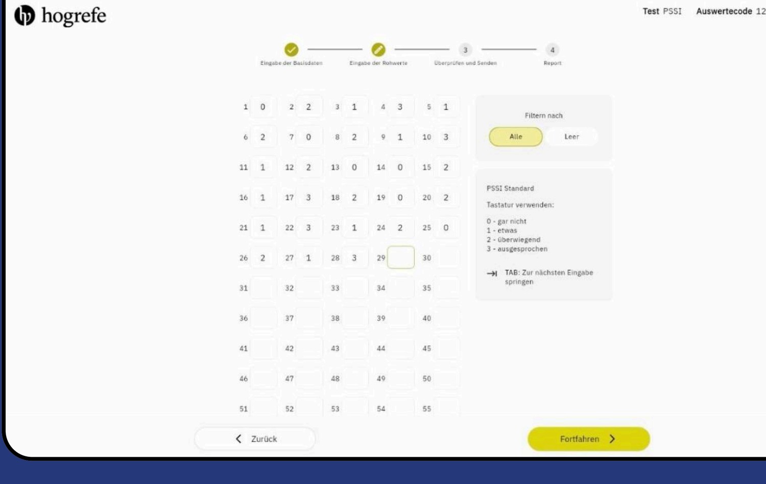
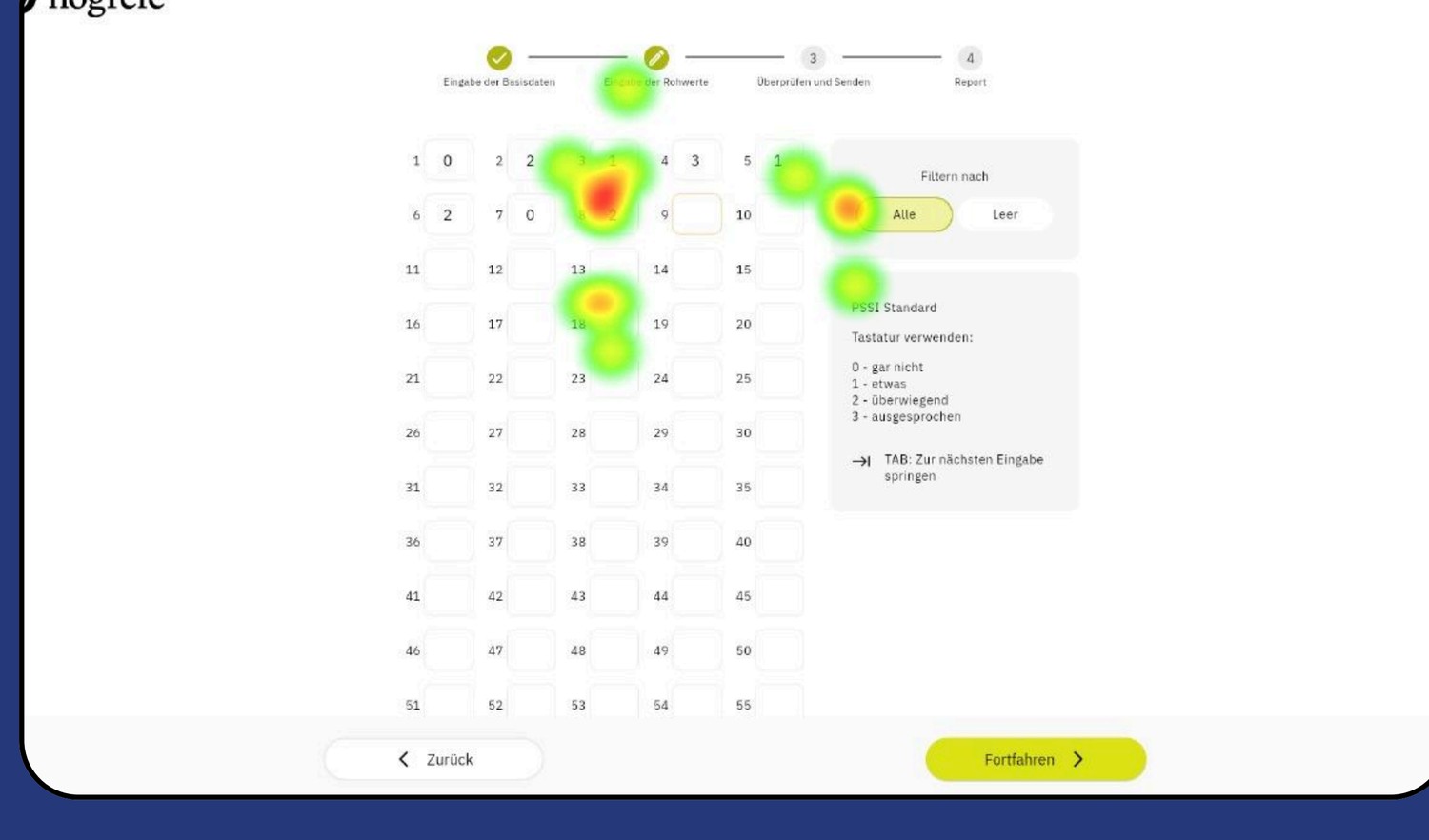
That scatter is the friction made visible. Every glance over to the legend and back is a small tax on a task users repeat hundreds of times, and it is exactly the kind of problem interviews alone would have missed.
08
Feature Improvements
I paired each friction point with a concrete, layout-driven fix. The first two are about clarity and trust; the third, the score grid, is where the design changes do the most work.
Pain point 1
Reluctance to share personal details
Participants felt annoyed and hesitant when asked to share personal information up front. This reads less like an interface bug and more like an experience question.
Recommendation: Re-evaluate whether that step is needed at all, and if so, when it is asked for, so it does not stall people at the start.
Pain point 2
Unclear whose details to enter
Right after the access code, participants were unsure whose details belonged in which field, the professional's or the subject's date of birth and gender.
Recommendation: Add a simple on-screen instruction, especially for first-time use, so the right data goes in the right place without guesswork.
Pain point 3
Hard to transcribe scores
Entering digits from the PSSI sheet felt uncomfortable, and the eye-tracking showed attention scattering as people hunted for the legend and the right cell instead of moving down the form.
Recommendation: Bring the layout to where the eyes already are.
The score-grid redesign came down to four specific moves.
Move the legend left
Place the scoring legend next to the grid, where attention already lands.
Show real progress
The screen shows 55 items when there are 140; add a scroll indicator for what is left.
Gate the continue button
Keep Continue inactive until every score is entered, so nothing is submitted half-done.
Fit the device
A horizontal layout that maps the grid to the screen instead of fighting it.
09
How It Improved the Platform
The study handed Hogrefe a prioritised, layout-specific set of changes rather than a vague “make it nicer.” Each recommendation traces back to observed behavior, so the team could act with confidence about what to fix first and why.
Calmer score entry
Moving the legend in beside the grid is aimed straight at the gaze scatter the eye-tracking exposed.
Fewer abandoned forms
A real progress cue plus a gated Continue reduce the chance of submitting an incomplete score sheet.
Confident first use
A single on-screen instruction removes the most common first-time hesitation.
Protecting what worked
The light, low-typing input people liked stays intact; the fixes refine it rather than replace it.
Because the tool was already well received, this was refinement, not rescue, and the most valuable outcome was turning “it’s fine” into a short list of changes the team could ship.
10
Reflection
People told us the tool was “fine.” Their eyes told a different story.
That gap is what stuck with me. On the score-entry screen, gaze jumped around instead of settling, and pairing what users said with where they actually looked is what turned vague frustration into three specific, fixable recommendations. It is the clearest reminder I have that self-reported ease and observed behavior are not the same thing.
I am honest about the edges, too: four participants, all from one university, and a heatmap capture that was partly lost to a software glitch. The triangulation held the signal together, but the natural next step is to test the redesigned score-entry layout with practicing clinicians and validate whether moving the legend and adding progress cues actually calms that scatter.
Want the full story behind this work?
Let's Chat